top of page


Packaging Design
The challenge was to keep the spirit and nostalgia alive, while giving the brand a tastier and more contemporary look
A brand embedded in Spain’s collective memory
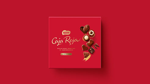


The use of gold was reduced to create a cleaner and more contemporary look, with the color retained in subtle details to preserve a sense of sophistication. At the same time, we increased the presence of red at the point of sale to boost visual impact and brand recognition.
Drawing inspiration from the world of artisanal chocolates, we introduced design elements that convey authenticity and craftsmanship, enhancing the perception of quality. The goal was to strengthen the brand’s premium positioning without losing the richness and indulgence associated with its flavor.
bottom of page